How Can the 60-30-10 Color Rule Be Applied Beyond Interior Design?
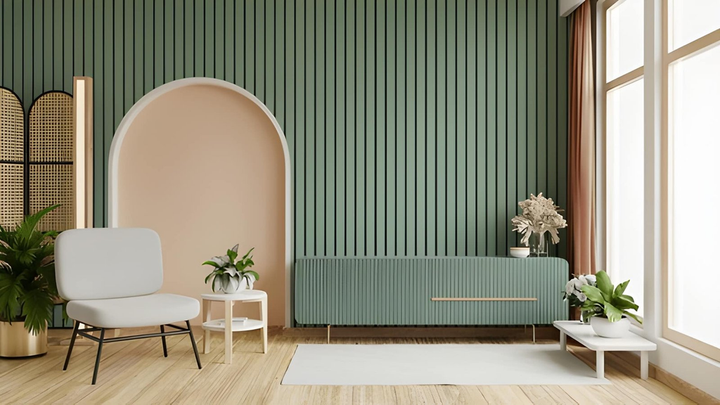
Choosing colors sounds simple until several colors have to work together. A palette may look attractive in isolation yet feel busy, flat, or confusing once it appears across a website, banner, outfit, event, or printed design. The 60-30-10 color rule offers a practical solution by giving each color a clear visual role. Although decorators often use this principle in interiors, the same ratio can create balance and hierarchy in many areas of everyday design.
What Is the 60-30-10 Color Rule?
The 60-30-10 color rule is a simple guideline for dividing a color palette into three roles. Roughly 60 percent of the visual area uses a dominant color, 30 percent uses a secondary color, and 10 percent uses an accent color.
In a living room, for example, the dominant shade might appear on the walls and large furniture. A secondary shade could show up in curtains, rugs, or chairs. The final 10 percent might come from cushions, artwork, lamps, or decorative objects.
The percentages do not need to be mathematically exact. Instead, they describe visual weight. The goal is to establish a clear hierarchy so that colors do not compete equally for attention.
Key takeaway: The 60-30-10 rule assigns about 60% to a dominant color, 30% to a supporting color, and 10% to an accent, creating a clear visual hierarchy.
Why Does the 60-30-10 Rule Work Outside Interior Design?
The principle works beyond decorating because people naturally notice differences in contrast, scale, and emphasis. If every color receives the same visual weight, viewers may struggle to understand where to look first. A dominant color establishes the overall mood, while the secondary color adds variety. The accent then draws attention to selected details.
This approach also limits unnecessary color choices. Instead of adding a new shade whenever something needs emphasis, designers can give each existing color a purpose. That makes a composition easier to understand and often easier to reproduce across different formats.
The rule is best treated as a framework rather than a law. Some projects work better with 70-20-10 or another variation. Accessibility and legibility should also take priority over a precise ratio. The Web Content Accessibility Guidelines (WCAG) provide useful guidance on contrast when colors appear in digital interfaces or alongside text.
Key takeaway: The rule works because it creates hierarchy. One color establishes the visual foundation, another adds support, and a smaller accent directs attention.
How Can You Apply 60-30-10 When You Make a Banner?
The rule becomes especially useful when you make a banner because banners have limited space and usually need to communicate a message quickly. Too many equally strong colors can distract from the headline or call to action.
Start by assigning approximately 60 percent of the design to the background or another large visual area. A light neutral, dark navy, muted green, or brand color can serve this purpose. Give about 30 percent to supporting elements such as illustrations, image treatments, shapes, or secondary text areas. Reserve the strongest accent color for roughly 10 percent of the composition.
That final color can highlight a button, price, date, short phrase, or other priority element. For example, a banner might use cream as its dominant shade, forest green as its secondary shade, and warm orange as its accent. The orange becomes more noticeable because it appears selectively rather than everywhere.
A simple process is:
- Decide what viewers should notice first.
- Choose a dominant color that supports the overall mood.
- Select a secondary shade that remains distinct without competing with the main message.
- Pick one accent with enough contrast to attract attention.
- Check text contrast and readability at the banner’s actual viewing size.
- Remove colors that do not have a clear purpose.
This same thinking connects naturally with broader decorating principles because both graphic and interior design depend on balance, focal points, proportion, and repetition. Readers exploring other colors and decorating advice on Tips by Decorator Advice can use those same ideas when planning visual projects outside the smart home.
Key takeaway: When designing a banner, let the dominant color establish the canvas, use the secondary color for supporting elements, and save the accent for the message that needs attention most.
Can the Rule Improve Website and Social Media Design?
Yes. Websites and social graphics benefit from a predictable color hierarchy because viewers often scan them instead of studying every detail. The 60-30-10 framework can help organize that hierarchy without requiring every page or post to look identical.
On a website, the 60 percent might include backgrounds and large content areas. The 30 percent could cover navigation, cards, illustrations, or secondary sections. The 10 percent could highlight buttons, active states, links, badges, or important notifications.
Social media graphics can follow a similar pattern. A brand might use an off-white background as the dominant color, a deep blue for headings and graphic shapes, and coral for small highlights. Repeating these roles across posts can create consistency while still allowing layouts to change.
However, color should never be the only way to communicate meaning. A red warning, for example, can also include an icon and clear wording. The W3C guidance on using color explains why important information should not depend solely on differences in color.
Key takeaway: Digital designs become easier to scan when dominant, secondary, and accent colors have consistent jobs, but contrast and accessibility should always come first.
How Can 60-30-10 Guide Clothing and Personal Style?
The same ratio can simplify outfit planning. Think of the largest clothing item or group of items as the dominant 60 percent. A secondary garment can provide the next 30 percent, while shoes, jewelry, a scarf, belt, bag, or another small feature supplies the final accent.
Consider an outfit built around navy trousers and a navy jacket. Together, they create the dominant visual field. A soft blue shirt can provide the secondary shade, while a rust-colored bag, tie, or scarf supplies a smaller accent. The outfit feels coordinated because one color clearly leads.
You do not need to calculate the visible surface area of every garment. The useful question is whether one shade dominates, another supports it, and the final shade appears selectively. Patterns can also participate in the ratio. A patterned scarf, for example, might function as the 10 percent accent even if it contains several colors.
Key takeaway: For clothing, think in terms of visual dominance rather than exact measurements: one main color, one supporting shade, and a small accent can create an easy-to-coordinate outfit.
How Can the Rule Help With Events and Table Styling?
Event styling can become visually cluttered because colors appear across flowers, linens, signage, tableware, lighting, invitations, and decorations. Assigning color roles before selecting individual pieces can keep the entire setting connected.
Suppose a garden lunch uses soft ivory as its dominant color. Ivory could appear in tablecloths, chairs, and larger signs. Sage green could provide the secondary 30 percent through napkins, foliage, menus, and smaller decorations. A dusty pink might appear in selected flowers, place cards, and small details.
The same method works for birthday parties, dinner tables, seasonal gatherings, and weddings. It can also prevent the common mistake of repeating an accent color so often that it stops feeling special. Accent colors are effective partly because they are limited.
Key takeaway: For events, assign colors by role before buying decorations. This keeps linens, flowers, signs, and accessories visually connected.
Can 60-30-10 Improve Packaging and Printed Materials?
Packaging, brochures, invitations, posters, and other printed materials often need to combine information with personality. A three-level color hierarchy can help prevent decorative elements from overpowering the message.
For packaging, the dominant shade might cover most of the box, label, or bag. A secondary color can identify a product family or support illustrations. The accent can highlight a flavor, feature, product name, or small graphic element. The same logic works when you make a banner, poster, flyer, or invitation.
Print introduces an extra consideration because colors on a monitor can differ from colors produced by a printer. Paper type, ink, finish, and surrounding colors can all change the final appearance. A physical proof is useful when color accuracy matters.
The 60-30-10 framework can organize the palette, but it cannot replace practical checks. Text still needs strong contrast, small details need to remain visible, and the most important information should be easy to identify at a glance.
Key takeaway: In print and packaging, use 60-30-10 to organize color roles, then test the real printed result for contrast, legibility, and color accuracy.
How Do You Choose Three Colors That Work Together?
A ratio cannot rescue three colors that clash badly or fail to provide enough contrast. Color selection therefore comes before color distribution.
One easy starting point is to choose a neutral dominant shade. White, cream, gray, charcoal, beige, and other restrained colors give the secondary and accent shades room to stand out. Another option is to choose three related colors from a warm, cool, earthy, or muted palette.
A color wheel can also help. Analogous colors sit near each other and usually produce a calmer effect. Complementary colors sit opposite each other and create stronger contrast. If the combination feels too intense, reduce the saturation of one or more shades instead of immediately adding more colors.
When text is involved, test the foreground and background combination separately from the overall palette. A harmonious palette does not automatically create readable typography.
Key takeaway: Choose compatible colors first, then apply the ratio. Harmony controls how the palette feels, while the 60-30-10 distribution controls how it is organized.
What Common 60-30-10 Mistakes Should You Avoid?
The first mistake is treating the numbers as exact measurements. Trying to calculate whether an accent occupies precisely 10 percent of a page, outfit, or room adds work without necessarily improving the result. Visual hierarchy matters more than mathematical precision.
Another mistake is choosing three equally intense colors. If bright red, vivid yellow, and electric blue all compete for attention, assigning percentages may not create enough harmony. Adjusting saturation, brightness, or neutrality can produce a more comfortable relationship.
It is also easy to overuse the accent. Once a bold color looks good on one button, cushion, or accessory, there is a temptation to repeat it everywhere. Doing so weakens its role as a focal point.
Before finishing a design, ask:
- Is there an obvious dominant color?
- Does the secondary color support rather than compete?
- Is the accent limited to important details?
- Can all essential text be read comfortably?
- Does the design still make sense without relying on color alone?
- Does every additional color serve a clear purpose?
Key takeaway: Use 60-30-10 as a flexible visual guide. Prioritize hierarchy, contrast, readability, and purpose instead of chasing exact percentages.
Frequently Asked Questions
Does the 60-30-10 color rule have to be exact?
No. The percentages describe approximate visual weight rather than a strict mathematical formula. Adjust them when the design, content, or accessibility requirements call for a different balance.
Takeaway: Aim for clear color hierarchy, not exact percentages.
Can I use more than three colors?
Yes. You can use variations of the three main colors, including lighter and darker shades. Additional colors can work too, but they should have a clear role rather than compete equally for attention.
Takeaway: More colors are possible as long as the dominant, supporting, and accent hierarchy remains clear.
What should the 10 percent accent color be used for?
Use it for elements that deserve attention, such as small accessories, focal decorations, important buttons, key words, dates, or selected graphic details.
Takeaway: Reserve the accent color for details you want people to notice.
Does the rule work with neutral colors?
Yes. Neutrals often make the method easier to use. A neutral can serve as the 60 percent foundation while stronger colors handle secondary and accent roles.
Takeaway: Neutral dominant colors give supporting and accent shades more room to stand out.
Is the 60-30-10 rule suitable for beginners?
Yes. It reduces a complicated color decision to three simple roles. Beginners can use it as a starting framework and adjust the balance as they become more confident.
Takeaway: The rule is beginner-friendly because it turns color selection into a simple hierarchy.
How Can You Start Using the 60-30-10 Rule Today?
The easiest way to use the 60-30-10 rule beyond interior design is to stop thinking only about individual colors and start thinking about their jobs. Choose one shade to create the foundation, another to provide support, and a final accent to direct attention.
That framework can guide a room, outfit, website, event, package, social graphic, or any project where several colors need to work together. It also provides a useful checkpoint when a design feels too busy. Identify the dominant color, reduce unnecessary competition, and make the accent meaningful.
The rule remains effective because it is flexible. Treat 60-30-10 as a visual starting point, then adjust it for readability, context, accessibility, and personal style.
Key takeaway: Across interiors, fashion, digital design, events, and renovation, 60-30-10 creates a simple goal: establish a dominant visual foundation, support it with a second color, and use the final accent with purpose.

Post Comment