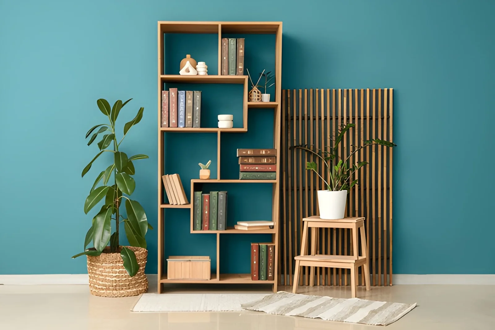
How to Style a Decorative Bookshelf?
A bookshelf is one of those surfaces where the difference between a space that looks designed and one that looks accumulated is most immediately visible. Pack a shelf with books spine-outward at maximum capacity and it reads as storage. Apply the specific styling logic that designers use and the same shelf — with the same books — reads as a composed, considered display that adds real character to the room.
Most US homeowners style a decorative bookshelf the way they organize a closet: everything gets a place, the priority is fitting things in, and aesthetics come last if at all. The result is shelves that hold everything and show nothing — functional but visually inert. The opportunity is significant precisely because styled bookshelves are so consistently more interesting than unstaged ones, and because the styling principles are learnable rather than requiring innate taste or professional training.
This article covers everything needed to transform a functional bookshelf into a decorative bookshelf that genuinely elevates the room it’s in: the object hierarchy, the color principles, the capacity rules, the layering techniques, and the specific mistakes that undermine shelf styling regardless of what objects are used.
The Foundational Principle: A Decorative Bookshelf Is a Composition
The shift from thinking about a bookshelf as storage to thinking about it as a composition is the most important conceptual change in bookshelf styling. A storage bookshelf asks: does everything fit? A decorative bookshelf asks: does everything contribute to the visual story the shelf is telling?
This means some things don’t go on the shelf. Not because they’re not worth having but because they don’t contribute to the composition — they clutter rather than curate. The edit is the most significant single decision in decorative bookshelf styling.
| Shelf Approach | Capacity Used | Visual Quality | Primary Purpose |
|---|---|---|---|
| Full storage (all books, all space used) | 95–100% | Low — reads as packed | Maximum storage efficiency |
| Lightly styled | 75–85% | Medium — better but unresolved | Hybrid — some aesthetics |
| Decorative bookshelf (properly styled) | 60–70% | High — curated, designed quality | Visual composition + storage |
| Over-styled (too few items) | Under 50% | Medium — too sparse | Uncomfortable minimalism |
The Decorative Bookshelf Styling Method
Step 1: The 60-70% Capacity Rule
The single most important rule in decorative bookshelf styling — and the one most consistently violated — is capacity. A shelf that’s 90% full reads as packed regardless of how carefully the objects are arranged. A shelf at 60 to 70% capacity has the breathing room that allows each element to read as individually chosen rather than crammed in.
This means removing things before adding anything. Most people approach styling by rearranging what’s there or adding objects to what’s already full. The correct sequence is to remove until the shelf is at 60 to 70% capacity, then arrange what remains, then add any specific styling objects that improve the composition.
Step 2: Create Height Variation Within Each Section
The eye finds bookshelves interesting when it has vertical variation to follow — different heights creating a visual rhythm that moves across the shelf rather than sitting at a uniform horizontal level. Most unstyled shelves have books all at approximately the same height, which produces a flat, uniform reading.
On a decorative bookshelf, height variation is created through:
Vertical books at different heights. Arrange books in groups — three to five together — with adjacent groups at different heights. This creates the rhythm of peaks and valleys that professional shelf styling always has.
Horizontal book stacks. A stack of two to four books laid horizontally creates a lower platform element that breaks the vertical rhythm and provides a surface for displaying a small object on top.
Objects of varying heights. Plants, vases, sculptures, and frames at different heights within each section contribute vertical variation that books alone don’t provide.
Step 3: The Section-by-Section Approach
Rather than styling a full decorative bookshelf from left to right, divide the shelf into sections of three to five books each and style each section as a small composition before moving to the next. Each section should contain:
- A group of vertical books (in the section’s dominant height)
- A horizontal book stack (creating a lower element)
- One or two objects relating to the section (at appropriate scale)
This section-by-section approach prevents the common problem of all objects clustering at one end and all books at the other — a distribution that creates two separate visual zones rather than one composed shelf.
| Decorative Bookshelf Section Formula | Component | Role in Composition |
|---|---|---|
| Vertical books | 3–5 books upright | Height, color, primary volume |
| Horizontal stack | 2–3 books flat | Lower element, object platform |
| Tall object | Vase, candlestick, tall plant | Height punctuation |
| Medium object | Ceramic, small sculpture, framed art | Mid-height interest |
| Small detail | Small object on horizontal stack, plant sprig | Close-range interest |
| Breathing space | Empty section of shelf | Visual rest — prevents cluttered reading |
Color Principles for a Beautiful Decorative Bookshelf
Color management is one of the most powerful and most underused tools in decorative bookshelf styling. Books have spines in every color; left unsorted, they create a visual noise that prevents the shelf from reading as a designed object.
The organized color approach: Group books by spine color — all warm tones together, all cool tones together, all neutrals together — and arrange the color groups across the shelf in a gradient or deliberate sequence. This approach makes the books themselves a design element rather than a neutral backdrop.
The neutral-forward approach: Turn books with bright or visually disruptive spines to face backward, showing only the page edges (which are typically white or cream). This creates a calm, neutral backdrop that makes decorative objects read more clearly. More dramatic in effect than the color-organized approach and preferred in minimal, contemporary interiors.
The selective color approach: Allow one accent color to appear throughout the shelf — all the red-spine books positioned in deliberate locations, while other colors are sorted to the back or replaced — creating a visual thread that runs through the decorative bookshelf composition.
| Book Color Approach | Visual Effect | Best for What Style |
|---|---|---|
| Organized by color (gradient) | Designed, intentional, visual interest | Most residential styles |
| Page-edges facing out | Calm, minimal, contemporary | Minimalist, Japandi, contemporary |
| Selective accent color | Focused, one-color thread through composition | When shelf must relate to room’s palette |
| Random/unsorted | Chaotic — most to avoid | Storage shelves not meant for display |
| All one color collection | Very intentional — collector quality | When you happen to have matching editions |
Objects That Elevate a Decorative Bookshelf
The objects on a decorative bookshelf do different things for the composition — and selecting them with an awareness of what each object’s role is prevents the random accumulation that undermines most shelves.
Structural objects (vases, candlesticks, sculptural pieces) provide height and form. They’re the architectural elements of the shelf composition — they create the vertical structure that books alone can’t provide.
Organic objects (small plants, branches, dried florals, stones, shells) introduce natural texture and the organic quality that manufactured objects lack. A small succulent on a horizontal book stack, a few dried stems in a bud vase, or a piece of coral as a sculptural element introduces the living-world quality that distinguishes personal collections from retail displays.
Personal objects (meaningful items, travel souvenirs, inherited pieces, small photographs) give the decorative bookshelf the specific personal quality that makes it feel inhabited rather than styled. One or two clearly personal objects per shelf section are enough — the rest can be curated for aesthetics without sacrificing the personal dimension.
Art objects (small prints, framed photographs leaned against books, small canvases) add image content that purely three-dimensional objects don’t provide. Leaning art rather than hanging it is a specific styling technique — it reads as casual and collected rather than formally installed.
Common Decorative Bookshelf Mistakes to Avoid
| Mistake | What It Produces | Correction |
|---|---|---|
| Over-capacity (90%+ full) | Packed, cluttered — no breath | Remove to 60–70% capacity |
| Uniform height throughout | Flat, uninteresting — no rhythm | Create height variation by section |
| Objects only at one end | Imbalanced — two separate visual zones | Distribute objects throughout |
| No horizontal stacks | All vertical — no level variation | Add stacks every 3–5 vertical book group |
| Too many small objects | Busy — individual pieces disappear | Fewer, larger objects read more clearly |
| No empty space | Everything competing — nothing prominent | Add deliberate empty sections |
| No color logic | Visual noise from random spine colors | Sort, turn around, or select by color |
| Only books, no objects | Reads as library storage — no personality | Add one non-book object per shelf section |
Frequently Asked Questions
What’s the most important rule for styling a decorative bookshelf?
Capacity. A decorative bookshelf should be 60 to 70% full — never more. The breathing room that this creates is what allows the eye to read each element individually rather than processing the shelf as a mass. Every other styling decision — color, height variation, object selection — performs better on a shelf with adequate negative space than on a packed one. Remove before you rearrange or add.
How many objects should be on a decorative bookshelf?
As a guideline, one to two objects per shelf section (three to five books each), varying in height and material. For a typical 6-shelf bookcase, this might mean 15 to 25 objects total across all shelves. Fewer, larger objects read more clearly than many small ones — a medium vase makes more impact than five tiny figurines occupying the same shelf section.
Should a decorative bookshelf have books or is it better without?
Books are almost always preferable to a purely object-based shelf. They provide scale, color, and the intellectual texture that differentiates a book collection from a retail display. A decorative bookshelf that’s entirely objects looks like a showroom — the books ground it in real life and real interests. The styling skill is in making the books participate in the composition rather than simply occupying space.
How do I style a decorative bookshelf if I don’t have many books?
Supplement with other items that have the same rectangular, stackable format: magazine collections bound with twine, decorative boxes, art books, vintage atlases or reference books sourced from secondhand shops, folded textiles. These fill the book role visually while the ratio of objects to books can shift to reflect what you actually have.
Can any bookshelf become a decorative bookshelf or does the furniture itself matter?
The furniture quality matters but doesn’t determine the outcome as much as the styling decisions. A simple IKEA Billy bookcase styled according to these principles reads better than an expensive bookcase styled randomly. Furniture with back panels — especially colored or wallpapered back panels — provides a backdrop that enhances the composition of objects in front of it, but the quality of the styling work matters more than the quality of the bookcase.
The Bottom Line
A decorative bookshelf that genuinely elevates a room is the result of specific decisions applied in sequence: remove to 60 to 70% capacity first, create height variation within each section, apply color logic to the books, introduce objects that play specific compositional roles, add organic elements for texture and life, and include one or two personal pieces that make the shelf specifically yours.
None of this is complicated. All of it is learnable. And the result — a bookshelf that reads as curated and designed rather than packed and accumulated — transforms one of the most visible surfaces in any room from background noise into a genuine design contribution.
Start by taking half of what’s on the shelf off. Everything else follows more naturally than you’d expect.
For decorative bookshelf ideas must visit https://tipsbydecoratoradvice.com/

Post Comment