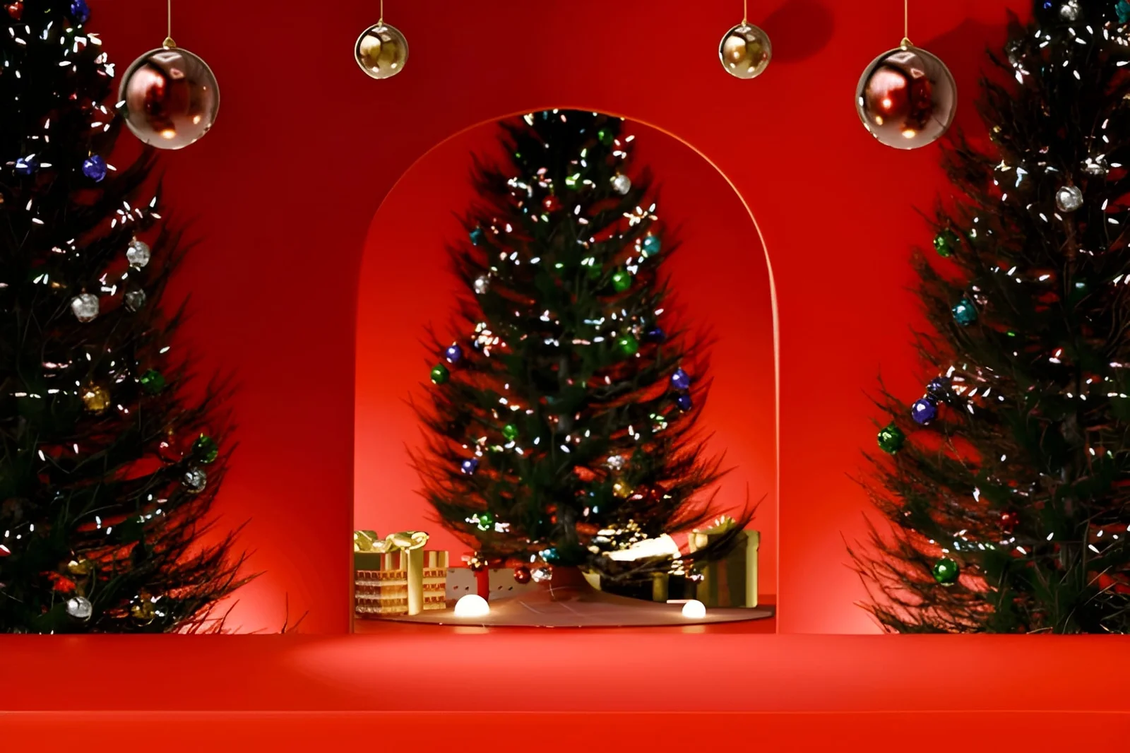
What Makes a Beautiful Christmas Display?
Every December, US homes transform — some into genuinely beautiful, cohesive expressions of the season that look as though someone thought carefully about what they were doing, and others into well-intentioned accumulations of decorations that look like everything in the holiday storage bin was deployed simultaneously without a plan. The gap between the two outcomes isn’t the size of the budget or the number of ornaments. It’s the presence or absence of specific design thinking applied to what is, at its core, a seasonal design project.
A beautiful Christmas display is one where every element relates to every other element — where the palette is controlled, the scale relationships are considered, the lighting creates atmosphere rather than simply marking the occasion, and the whole reads as intentional rather than accumulated. These are the same principles that make any decorated space work or fail. December doesn’t suspend the rules of visual coherence; it just changes the color palette and the subject matter.
This article covers the specific decisions that distinguish a beautiful Christmas display from one that’s enthusiastic but visually unresolved — from tree curation to exterior lighting to the room-level design logic that makes holiday decorating feel designed rather than deployed.
The Design Principles Behind a Beautiful Christmas Display
Before covering specific elements, the underlying principles that govern any beautiful Christmas display are worth establishing. They’re consistent with the principles behind any well-designed space — and applying them to holiday decorating produces results that consistently outperform the everything-from-the-bin approach.
| Design Principle | Generic Christmas Display | Beautiful Christmas Display |
|---|---|---|
| Color palette | Everything — red, green, gold, silver, blue all present | 2–3 colors with clear hierarchy |
| Scale relationships | Mix of sizes without proportion logic | Dominant large elements with smaller supporting ones |
| Negative space | Every surface decorated | Deliberate restraint — empty space is part of the design |
| Lighting quality | Functional — visible, marking the occasion | Atmospheric — warm, layered, creating mood |
| Cohesion | Each piece chosen independently | Elements relate to each other and to the room |
| Personal specificity | Generic retail ornaments | Mix of meaningful and curated pieces |
| Editing | Everything comes out | Selective deployment of the best pieces |
What Makes a Beautiful Christmas Tree
The tree is the focal point of most indoor Christmas displays and the element where design decisions have the most significant visual impact. Most Americans decorate trees by deploying everything they own — lights first, then ornaments distributed until the storage containers are empty. The result is often a tree that looks full without looking curated.
The Palette Decision: The Single Most Important Tree Choice
A beautiful Christmas display almost always starts with a palette decision for the tree — two or three colors applied consistently throughout, with any fourth color used as a very minor accent. The most consistently elegant approaches:
Monochromatic: All ornaments in shades of one color — all white and silver, all gold and amber, all deep red and crimson. The variation within the palette comes from different textures and sizes rather than different colors.
Classic two-color: A dominant neutral (gold, silver, white) with one accent color (deep green, navy, burgundy). The neutral creates cohesion; the accent provides visual interest.
Nature-inspired: Tones borrowed from natural materials — dried citrus, pine cones, berries, natural wood — with no synthetic colors. This approach produces trees that feel organic and timeless rather than festive in the conventional sense.
| Christmas Tree Palette | Colors Used | Atmosphere Created | Best Tree Type |
|---|---|---|---|
| Classic silver and white | Silver, white, crystal | Elegant, cool, restrained | Spruce, fir, noble fir |
| Warm gold and cream | Gold, cream, champagne | Warm, traditional, rich | Douglas fir, fraser fir |
| Deep moody tones | Navy, forest green, black, gold | Dramatic, contemporary | Any dark-needled variety |
| Natural / organic | Brown, cream, copper, berry red | Rustic, authentic | Flocked or natural |
| Red and green (classic) | Red, green, gold | Traditional, cheerful | Any variety |
| All white | White, pale gold, crystal | Minimal, serene, modern | Flocked or white artificial |
Ornament Scale and Placement
The distribution of ornament sizes is where most US Christmas displays visually fail. When all ornaments are approximately the same size, the tree reads as evenly textured rather than composed. Beautiful Christmas displays use a scale hierarchy: a few large ornaments (4 to 6 inches) as anchor pieces, more medium ornaments (2 to 3 inches) as the primary layer, and small ornaments and detailed pieces as the final layer that fills gaps and adds visual complexity.
Large ornaments go near the center and lower-middle sections of the tree where they’re most visible. Small detail pieces go toward the tips of branches and the top of the tree where their delicacy is readable.
Lighting: The Foundation of Every Beautiful Christmas Display
The lights go on before any ornament, and their quality determines the success of everything that follows. The two variables that matter most:
Quantity: Most trees are underlit by at least 50%. The rule of thumb is 100 lights per vertical foot of tree — a 7-foot tree needs approximately 700 lights for a genuinely luminous appearance. Underlit trees look sparse regardless of ornament quality.
Temperature: Warm white (2700K to 3000K) lights produce the classic, atmospheric Christmas tree quality. Cool white and multi-color lights produce a different aesthetic — not wrong, but a specific choice rather than a universal default. Warm white is the most consistently flattering option for ornaments, skin tones, and the overall room atmosphere.
Exterior Christmas Display: The Principles That Produce Curb Appeal
An exterior Christmas display that reads as beautiful from the street follows design logic that most holiday lighting ignores: scale, restraint, consistency, and the relationship between the lighting and the home’s architecture.
Follow the architecture. The most elegant exterior Christmas displays outline the home’s actual architectural features — rooflines, window frames, door surrounds, columns, porch railings — rather than covering surfaces with random light placement. Architecture-following lighting reads as deliberate; surface-covering lighting reads as accumulated.
Restraint over abundance. The US tradition of maximalist exterior Christmas lighting produces displays that are enthusiastic and visually chaotic. The homes that generate genuine admiration rather than simply attention almost always use restraint — fewer elements deployed with greater intention. One luminous wreath on each window, precise roofline lighting, and flanking lanterns or tree-wrapped lights as a focal element is more beautiful than every surface covered with unrelated elements.
Consistent light color. Mixing warm white, cool white, multi-color, and blinking lights in a single exterior Christmas display produces visual noise. A single light color throughout reads as considered. Warm white is the most consistently successful choice because it flatters the home’s material colors and reads as sophisticated rather than festive in the generic sense.
| Exterior Christmas Display Element | Beautiful Approach | Common Mistake |
|---|---|---|
| Roofline lights | Follow roofline precisely, consistent spacing | Uneven hanging, mixed colors |
| Window treatment | One wreath per window or consistent light frames | Unmatched treatments on different windows |
| Door surround | Greenery or lights that frame the door | Overcrowded with competing elements |
| Tree or shrub lighting | One or two significant elements | Every shrub decorated differently |
| Pathways | Consistent stake light type and spacing | Mixed products at irregular intervals |
| Inflatable decorations | Absent or maximum one significant piece | Multiple competing inflatables |
Interior Christmas Display Beyond the Tree
A beautiful Christmas display extends beyond the tree to the room’s other surfaces — but with greater restraint than most US approaches apply. The mantel, the dining table, window sills, and entry are the secondary display zones that, when treated with palette coherence and scale logic, make the whole room feel seasonally complete.
The mantel: The fireplace mantel is the second most significant Christmas display surface after the tree. A beautiful mantel display uses a single garland as the base element (fresh greenery, dried or faux depending on preference), adds a few significant objects at varied heights (candlesticks, lanterns, small figurines), and uses the same palette as the tree. The mantel and tree should read as related — part of the same Christmas display rather than two independent decorating decisions.
The dining table: A Christmas display on the dining table should be functional before decorative — centerpieces must allow sightlines across the table, must be low enough to not obstruct conversation, and must leave adequate surface space for actual dining. A long table runner with low candles, pine cone clusters, and small greenery sprigs at consistent intervals is more functional and more beautiful than a large central arrangement that requires relocation for meals.
Frequently Asked Questions
What’s the most important decision in creating a beautiful Christmas display?
The color palette — specifically, limiting it to two or three colors and applying them consistently across all Christmas display elements from tree ornaments to mantel décor to exterior lighting. A Christmas display with palette discipline consistently outperforms one with more elements but no cohesion. Editing what comes out of storage to enforce the palette decision is the specific action this requires.
How many ornaments should a Christmas tree have?
Approximately 10 to 15 ornaments per vertical foot of tree is the typical range for a full-looking but not overloaded tree — a 7-foot tree would have 70 to 105 ornaments in a range of sizes. The number matters less than the size distribution: ensure that approximately 20% are large ornaments, 60% are medium, and 20% are small. This scale hierarchy produces the composed, professional look that equal-size ornament distribution doesn’t achieve.
Is it better to use warm white or multi-color Christmas lights?
For a beautiful, elegant Christmas display, warm white (2700K to 3000K) is the most consistently successful choice — it complements ornament colors regardless of palette, flatters the room’s existing décor and lighting, and produces the classic atmospheric quality most homeowners are aiming for. Multi-color lights are a deliberate aesthetic choice that works well in certain playful, family-centered displays; they’re not a universal default.
How do I make an exterior Christmas display look designed rather than just decorated?
Follow the home’s architecture rather than covering its surfaces. Outline rooflines, frame windows, highlight columns and entry features. Use one consistent light color throughout. Exercise restraint — identify two or three significant elements and make each one excellent rather than deploying everything available. The exterior Christmas display that looks best from the street is almost always the one that uses fewer elements with greater precision.
What should I actually do with holiday decorations I never use anymore?
Edit ruthlessly before the season starts — remove anything that doesn’t fit the palette you’ve chosen, anything that’s in poor condition, and anything that’s been passed over for three or more consecutive years. Donate what’s still good. The Christmas display that fits your curated storage containers entirely, with room to spare, is always better than the one that requires everything from the attic to look full.
The Bottom Line
A beautiful Christmas display comes from applying the same design principles to seasonal decorating that govern any well-designed space: palette discipline, scale hierarchy, lighting quality, restraint that privileges a few excellent elements over abundant mediocre ones, and the coherence that makes every element read as part of a single considered display rather than a collection of individual decorating decisions.
None of this requires a larger budget or more decorations. In most cases, it requires fewer decorations deployed with greater intention — which means the path to a more beautiful Christmas display this season likely starts with editing rather than shopping.
Start with the palette. Let everything that doesn’t fit stay in storage. Make what comes out excellent.
Must visit https://tipsbydecoratoradvice.com/ for beautiful christmas display ideas.

Post Comment